Every year, the announcement of the color of the year sparks excitement across design, architecture, and manufacturing. For 2026, two leading paint brands have unveiled their picks so far:
Sherwin-Williams – Universal Khaki: a fresh, versatile neutral that works with both warm and cool palettes
Benjamin Moore – Silhouette: a dark, mysterious brownish-gray that adds depth and sophistication
These selections are more than just visual inspiration. They influence design trends across furniture, kitchen and bath, and window fashions. They also highlight the growing importance of configuration in manufacturing, allowing designers and manufacturers to adapt products quickly to shifting color preferences.
The Role of Color in Modern Design Trends
The color of the year significantly impacts how people perceive spaces. Neutrals like Universal Khaki create a sense of calm and versatility, while darker tones like Silhouette add drama and luxury. Manufacturers who can translate these colors into products quickly are better positioned to meet consumer demand.
This is where configuration tools integrated into ERP systems come in. By using software that allows for real-time color and finish customization, manufacturers can offer more personalized options without disrupting production schedules or increasing errors.
Universal Khaki: A Neutral That Inspires Versatility

Universal Khaki – 2026 Sherwin-Williams Color of the Year. Photo courtesy of Sherwin-Williams.
Universal Khaki is ideal for products that need to appeal to a wide audience. It’s a warm, neutral blend with green undertones that works across multiple design mediums and trends:
Furniture
Universal Khaki is a versatile shade that pairs well with rich, dark, or light woods for a natural, grounded look and blends smoothly into warm neutral palettes with cream or white. It works as a soft base for bold design accents like lemon yellow, deep blues, or oxblood red. Plus, its earthy feel is strengthened by natural materials such as linen, rattan, stone, and leather.
The color also complements brass or black hardware, especially in cabinetry. It also fits seamlessly with both modern clean-lined furniture and vintage or patterned pieces for traditional or maximalist styles.
Kitchens and Baths
Universal Khaki works well in two-tone kitchens, with white uppers and khaki lowers for a clean, sophisticated look. It can also be used on all cabinets for a warm, timeless feel or on the walls paired with white cabinetry for a cozy touch of color. The shade pairs nicely with warm countertops like Taj Mahal quartzite or marble and complements brushed brass or black hardware.
In bathrooms, Universal Khaki creates a calming backdrop when used on the walls with white vanities and tile. It also makes a great vanity color for traditional or farmhouse styles. For a more modern look, pair it with sleek finishes and neutral accents. Good lighting with warm-to-neutral bulbs highlights the color’s soft, natural tone.
Window Fashions
Universal Khaki pairs well with sheer or light-filtering shades in off-white or ivory for an airy look. Tone-on-tone drapery adds subtle sophistication, while woven bamboo or grass shades enhance its natural warmth. For a modern edge, layer contrasting roller shades or use textured fabrics with mixed warm and cool tones.
Coordinate with soft whites, creams, and light neutrals to create a calm, monochromatic palette with Universal Khaki. Blues and crisp whites offer a coastal feel, while henna or cognac add rustic warmth. Deep navies or terragons provide a dramatic contrast, and cool grays or brushed metal accents give a contemporary touch.
Silhouette: Dark Elegance for Bold Design Trends
Silhouette is a deep, muted brown with cool violet undertones that brings a sophisticated, dramatic feel to any space. Its versatility allows it to serve as a bold, moody backdrop or as a grounding neutral when paired with lighter colors.
Furniture
Silhouette is inspired by classic suiting, blending rich espresso browns and charcoal for a sophisticated look. It can be applied to entire furniture pieces, contrasting elements like millwork or doors, or as a striking accent, pairing beautifully with lighter colors, natural woods, and metallic finishes.
For cabinets and millwork, the color adds a luxurious touch while helping hide wear and tear. On accent pieces such as chairs or tables, it creates a bold, refined point of contrast. Painting doors and trim in Silhouette provides drama without the starkness of black and white.
Plus, the color pairs well with a variety of other colors like whites and off-whites, grays and blacks, and warm-toned woods, brushed bronze, or patinated metals.
Kitchens and Baths
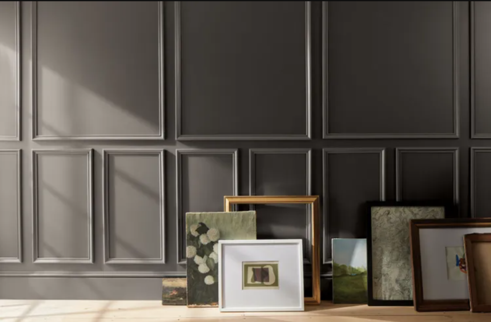
Silhouette – 2026 Benjamin Moore Color of the Year. Photo courtesy of Benjamin Moore.
In kitchens, Silhouette works well on lower cabinets for a tuxedo-style or high-contrast look. Balance its depth with lighter upper cabinets, countertops, and backsplash, and pair it with rich dark woods or softer tones like oak for a cohesive finish.
The color creates impact as an accent wall behind a bathroom vanity or tub and can be used to color-drench a powder room for a moody effect. Because it can visually shrink small spaces, keep the remaining walls and ceiling light, warm whites help maintain openness.
For general use, Silhouette adds elegance when applied to millwork, doors, trim, or built-ins. It shines in high-contrast palettes with crisp whites or soft neutrals and is ideal for spaces where you want depth, drama, and sophisticated comfort.
Window Fashions
Silhouette can be used in window treatments such as drapes, blinds, or shades to create an elegant and layered look. In rooms with lighter walls, it provides a bold contrast that turns window frames or full drapes into a dramatic focal point. For a more immersive, moody atmosphere, the color can extend throughout the room, even onto trim and millwork around the windows. It also pairs beautifully with materials like linen, marble, oak, and metallic finishes such as aged bronze or brushed brass, making it a versatile choice for a complete window design.
Using rules-based configuration tools, manufacturers can easily pair Silhouette with complementary colors, finishes, and materials, making it easier to offer luxurious, on-trend products at scale.
How Configuration Supports Color of the Year Trends
Manufacturers leveraging ERP-integrated product configuration can respond to color-of-the-year trends faster and more efficiently. Key benefits include:
- Easier Product Data Management: Updating finish and color libraries in real-time
- 3D Visualization During Quotation Process: Providing customers with a view of the final product before manufacture
- No-Hassle Pricing Updates: Automatically adjusting pricing based on new materials or finishes
- Seamless Master Scheduling: Ensuring production schedules align with custom selections
- Optimized Collaboration: Streamlining communication between sales, design, and manufacturing teams
This approach ensures that the latest design trends are translated into real products without delays or costly errors.
Conclusion: From Color Trends to Configurable Design Success
The 2026 color of the year selections are more than just seasonal inspiration. They represent an opportunity for manufacturers to innovate and adapt. By utilizing Frontier ERP’s built-in configuration tools in their operations, manufacturers can quickly bring new color trends to life in furniture, kitchen, bath, and window fashion products.
For more details about Frontier’s extensive product configuration options or other features, click the link below!